

My dashboards — what each one is for
A quick map of AdShift's Analyze dashboards — what each one is for, who it's for, and when to use it. Start at Overview, then dive into the detail.
AdShift's Analyze section is a set of focused dashboards. Each one answers a specific question and owns a specific kind of depth — so they complement each other instead of repeating the same numbers in five places.
The idea is simple: Overview is the hub. It gives you the daily pulse of the whole account and hands you off to the dashboard that owns the detail for your question. Every other page goes deep on one thing.
Use this guide to pick the right screen for the question you have.
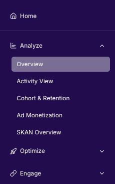
Overview
The daily pulse of your account.
- Question it answers: "Is my marketing paying off — and where?"
- What it shows: the full chain spend → installs → revenue → ROAS across every channel and app; Unified / User Acquisition / Retargeting views; optional SKAN-blended mode for the full iOS picture.
- Who it's for: UA managers, founders, CMOs — anyone who wants the whole account at a glance, plus a starting point to dig deeper.
Read more: Overview dashboard
Activity View
Engagement and in-app behaviour.
- Question it answers: "How many active users do I have, how loyal are they, and what do they do in the app?"
- What it shows: DAU / WAU / MAU and stickiness, sessions and sessions-per-user, new loyal users with trends, top in-app events, and event drill-downs (per media source ↔ per event).
- Who it's for: product and growth teams.
- What it deliberately leaves out: paid cost / ROAS / attribution — that's Overview's job.
Cohort & Retention
Unit economics per acquisition cohort.
- Question it answers: "Do users acquired on a given day stick around — and repay their acquisition cost within N days?"
- What it shows: retention / revenue / ARPU / sessions heatmaps, lifetime curves ("days since conversion"), cohort-based cost, eCPI, ROAS and ROI, saved reports, CSV export.
- Who it's for: UA and growth analysts.
- Good to know: "ROAS" and "eCPI" here are cohort-based (anchored to the acquisition date and the users' lifetime). The same names on Overview are calendar-based. Both are correct — they answer different questions.
Read more: Cohort & Retention dashboard
Ad Monetization
Ad revenue, at impression level.
- Question it answers: "How much do I earn from ads — and which network, format or placement drives it?"
- What it shows: impression-level ad revenue (ILRD): impression-weighted eCPM, impressions, and five dimensions — mediation source, ad network, ad type, placement, ad unit — plus a stacked revenue trend per mediation network.
- Who it's for: monetisation and product managers.
SKAN Overview
iOS SKAdNetwork performance and measurement diagnostics.
- Question it answers: "How much does paid iOS really deliver, and how much can I trust the SKAN signal?"
- What it shows: raw postbacks, unique-install de-duplication, two date axes (postback arrival vs estimated install date), conversion-value decoding into events, and signal-quality diagnostics.
- Who it's for: iOS UA managers and measurement analysts.
- Good to know: this is where all SKAN depth lives. Overview's "Deterministic + SKAN" mode uses the same data but de-duplicates it against SDK attribution — so the two pages intentionally show different numbers.
SRN Insights — Network Self-Reports
What each ad network reports about itself.
- Question it answers: "What do Meta / Apple Search Ads / Google / TikTok say about my campaigns, before I compare with MMP attribution?"
- What it shows: each network's own spend, impressions, clicks/taps, conversions and native metrics, with partner-specific drill-downs (Meta: campaign → adset; Apple/Google: → keyword; TikTok: → ad).
- Who it's for: media buyers.
- Good to know: these are self-reported numbers and will differ from AdShift attribution by design. For attribution, use Overview.
Protect
Anti-fraud filtering.
- Question it answers: "How much traffic did we block, from where, and why?"
- What it shows: blocked clicks / impressions / events, block rate, block reasons, and breakdowns by country and event.
- Who it's for: ad-ops and marketers keeping traffic clean.
SDK Information
What your installed base is running. This one sits in Settings → SDK, not in Analyze, but it belongs in the same list because it answers a question none of the pages above can.
- Question it answers: "Which app, SDK and OS versions are my users actually on — and how many of them allow tracking?"
- What it shows: app / SDK / OS version adoption over time, device types and models, and for iOS the ATT status mix, consent rate per app version, and the share of users on iOS 16.1+.
- Who it's for: mobile developers and release managers deciding when to drop an old version, and anyone judging a change to the ATT prompt.
- Good to know: it describes your installed base, not your marketing. There are no campaigns, costs or media sources here.
Read more: SDK Information dashboard
Why the split matters
Every dashboard has one job. That keeps each screen fast and readable, and it keeps the numbers honest — when a metric appears in two places with different values (like cohort ROAS vs calendar ROAS, or SKAN raw vs blended), it's because the two pages are answering different questions, and each page tells you which one.
When you're not sure where to start: start at Overview, spot what changed, and follow the Dive deeper links.
Measure push notification re-engagement
Use RightLinks in push notifications to bring users back and measure the return as re-engagement.
Cohort and retention
Measure how users acquired on the same date behave over time: retention, revenue, ARPU, sessions and cost KPIs (eCPI, ROAS, ROI), split by UA, Retargeting or Unified view.