

Cohort and retention
Measure how users acquired on the same date behave over time: retention, revenue, ARPU, sessions and cost KPIs (eCPI, ROAS, ROI), split by UA, Retargeting or Unified view.
The Cohort dashboard groups users by when you acquired them (their conversion date) and follows each group's behavior over the days, weeks and months that follow. Instead of asking "how much revenue did I make yesterday?", it answers questions like:
- What share of the users I acquired last week still open the app 7 days later?
- How much revenue does an average user generate in their first 30 days?
- On which day does a campaign's cumulative revenue overtake its cost (break even)?
- Are the cohorts I'm buying this month better or worse than last month's?
Key concepts
Cohort
A cohort is the set of users whose conversion (install, re-attribution or re-engagement) happened on the same date — or in the same week or month, depending on the row granularity you pick. A user's dimensions (media source, campaign, country, platform) are frozen at the moment of conversion, so cohort rows never shift as users change behavior later.
Cohort day (D0, D1, D7…)
Every user has their own day zero: the calendar date of their conversion. D7 means "7 days after that user's conversion", not a fixed calendar date. When the dashboard shows D7 retention for the cohort of June 1, it looks at what those users did on June 8.
💡 This is the single most important idea on this dashboard. The horizontal axis of the table and the lifetime chart is user age, not the calendar.
Conversion window
The date range filter selects which cohorts you look at (users acquired between those dates) — it does not limit how far their activity is followed. A 30-day window ending today with D0–D30 columns shows activity that happened up to 30 days after each user's conversion.
View types: User acquisition, Retargeting, Unified
The dashboard follows the same view-type model as the rest of AdShift:
Each view answers two separate questions: which users form the cohort rows, and which of their events are counted.
| View | Cohort rows | Events counted | Typical use |
|---|---|---|---|
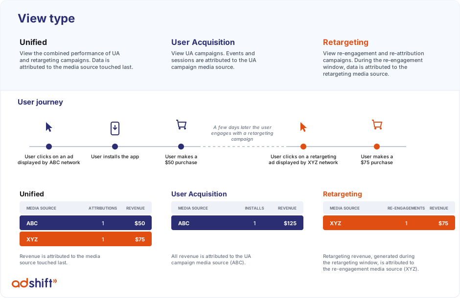
| User acquisition (UA) | Install cohorts only (users grouped by their original install date and UA source) | All of the cohort's activity — including purchases made during later retargeting windows, credited back to the install's source | Evaluating UA campaigns and organic growth |
| Retargeting | Re-attribution and re-engagement cohorts | Activity generated inside the retargeting attribution windows, credited to the retargeting source | Evaluating retargeting campaigns |
| Unified | Everything, each user counted once | Each event exactly once, credited to the media source touched last | Overall picture without double counting |
Note that UA is not "retargeting-free": if a user you acquired later engages with a retargeting campaign, their in-window purchases appear in both the UA view (under the install's source) and the Retargeting view (under the retargeting source). That double credit is by design — it lets you judge the full lifetime value of an acquired user and the retargeting campaign's own performance at the same time. It also means UA revenue can be higher than Unified, which deduplicates.
Example
A user clicks an ad from network ABC, installs, and buys for $50. Weeks later they click a retargeting ad from network XYZ and, inside the re-engagement window, buy for $75.
The KPI boxes
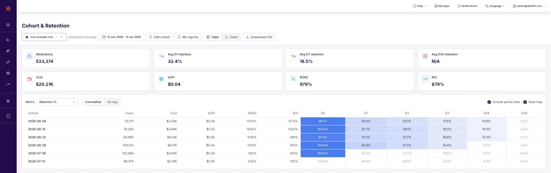
The boxes at the top summarize the whole conversion window:
- Attributions — cohort members acquired in the window.
- Avg D1 / D7 / D30 retention — cohort-size-weighted averages, computed only from cohorts old enough to have completed that day (young cohorts don't drag the average down). Hidden when the table uses weekly or monthly columns.
- Cost, eCPI, ROAS, ROI — shown only when we have spend data for the window (see Cost KPIs below).

The cohort table
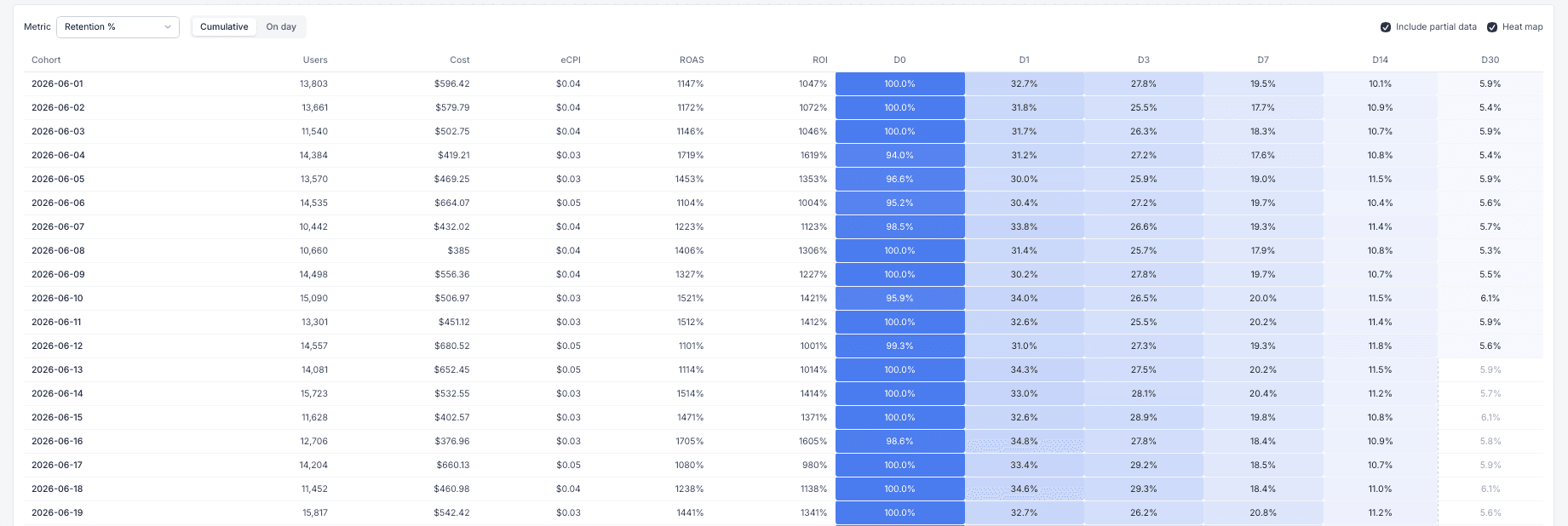
Each row is one cohort (a conversion date, week or month). Each column is a cohort period (D0, D1, D3… or W0, W1… / M0, M1…). The cell shows the selected metric for that cohort at that age. Heatmap coloring makes strong and weak cohorts visible at a glance; it can be toggled off.

Fixed context columns
Besides the metric cells, every row shows:
| Column | Meaning |
|---|---|
| Users | Cohort size (members acquired in that bucket) |
| Cost | Spend attributed to that bucket's conversion dates, summed across all cost sources |
| eCPI | Cost ÷ Users |
| ROAS | Cohort's lifetime-to-date revenue ÷ cost, as a percentage |
| ROI | (Revenue − cost) ÷ cost — always ROAS minus 100% |
Cost, eCPI, ROAS and ROI are lifetime-to-date for the row: they don't change with the metric dropdown or the Cumulative/On-day toggle, and young cohorts' ROAS keeps growing as revenue accumulates.
Metrics
| Metric | What the cell shows | Cumulative / On day |
|---|---|---|
| Retention % | Share of the cohort active on day N (based on sessions) | Always on-day |
| Revenue | Revenue generated by the cohort | Both |
| ARPU | Revenue ÷ cohort size | Both |
| Sessions per user | Sessions ÷ cohort size | Both |
| Revenue count | Number of revenue events (purchases, subscriptions) — ad impressions excluded | Both |
| Avg revenue count / user | Revenue events ÷ cohort size | Both |
Notes:
- Cumulative sums days 0..N; On day shows day N alone. D0 is identical in both.
- Revenue type lets you restrict revenue metrics to in-app purchases only or ad revenue only.
- Revenue count deliberately excludes ad-revenue impressions — an ad-monetized app would otherwise show thousands of "revenue events" per day and drown out purchases. If your app monetizes mainly with ads, expect small revenue counts alongside healthy revenue.
- Per-user values on big cohorts are often tiny (e.g. 30 purchases across a 79,000-user cohort = 0.0004 per user). The dashboard shows up to 4 decimals for such values.
Row and column granularity
- Cohort rows — group conversion dates by day, week or month. Weekly rows labelled
2026-06-08cover conversions from June 8–14. - Cohort columns — day columns are sparse (D0, D1, D3, D7, D14, D30…); week/month columns (W0, W1… / M0, M1…) aggregate full 7-day / 30-day periods of user age and count unique users per period, so a user active on 5 days of week 1 counts once in W1.
Only complete periods are shown for weekly/monthly columns: W1 appears once a cohort could have lived through all 7 of its days.
Pagination and export
Long ranges paginate (25/50/100 rows per page). Export CSV downloads the table at daily resolution; exports are capped at 10,000 rows and the dashboard tells you if the cap trimmed the file.
Partial data
The most recent cohorts haven't lived long enough to fill every column — a cohort acquired yesterday simply has no D7 yet. The dashboard marks this everywhere:
- In the table, cells for periods a cohort hasn't completed are faded. They form a "staircase" in the bottom-right corner: the younger the cohort, the fewer columns it has filled.
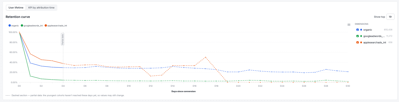
- On the lifetime chart, each line is solid up to the last day for which all cohorts in the window have final data, and dashed beyond it. A vertical marker sits exactly where the dashes begin, and tooltips append "(partial)" to affected values.
What "partial" means for the numbers:
- Ratio metrics (retention, ARPU, sessions per user): the value at day N is computed only from cohorts that already completed day N — younger users are left out entirely, not counted as inactive. The value is real, but it's based on the older part of your window and can shift slightly as younger cohorts mature into it.
- Absolute metrics (revenue, revenue count in cumulative mode): the dashed tail will keep growing over the coming days as young cohorts add their spending.
Worked example — window June 13 → July 11, today is July 13: the youngest cohort (July 11) has completed D0 and D1, so the chart is solid through D1 and dashed from D2 onward. The D10 point exists and is real — it comes from cohorts acquired on or before July 3 — but tomorrow the July 4 cohort joins the D10 calculation, so the point may move.
Untick Include partial data to hide the partial region entirely: the table drops incomplete cells and the chart ends where complete data ends.
Charts
Switch between the table and chart with the view toggle. There are two chart modes:
User lifetime
Curves over days-since-conversion (D0 → D30…), one line per dimension — media source, campaign, country, platform, attribution type, conversion type or app, depending on Group by. Use Show top (5/10/20) to limit the lines and the checkbox rail to hide individual dimensions.
Typical reading: compare the shape of the curves. Two media sources with the same D1 but different D7 tell you which one buys durable users.
KPI by attribution time
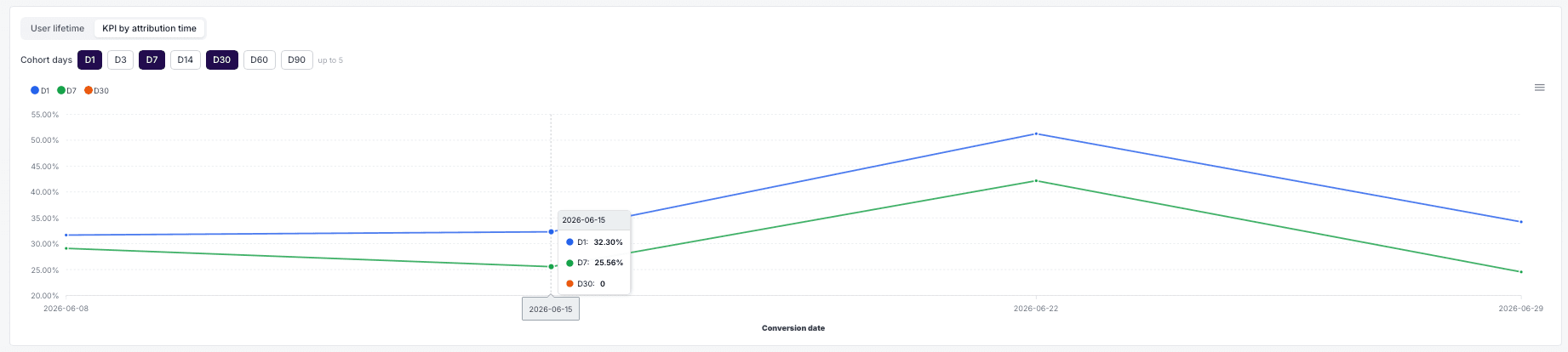
Flips the axes: the horizontal axis is the conversion date and each line is a fixed cohort day (D1, D7, D30 — pick up to 5). This answers "are the users I acquired in June better than the ones from May?" — a rising D7 line means cohort quality is improving over time.
Cells a cohort hasn't completed yet are gaps, not zeros.
Cost KPIs (Cost, eCPI, ROAS, ROI)
Spend is aggregated from every cost source connected to your account: partner API integrations (Meta, Google, Apple Search Ads, TikTok) and CSV cost imports.
Cost KPIs are hidden — rather than shown as a misleading $0 — when we can't attribute spend honestly:
- in the Retargeting view (cost sources don't provide a reliable retargeting split),
- when a platform filter (iOS/Android) is active (cost sources don't carry a platform dimension),
- when the campaign filter selects only organic traffic,
- when there is simply no spend data in the window.
⚠️ Interpreting blended cost KPIs: without a media source filter your cohort includes organic users, while cost covers only paid campaigns — so blended eCPI looks unrealistically low and ROAS unrealistically high. To judge campaign efficiency, filter by media source (and optionally by campaign) first.
Filters and setup
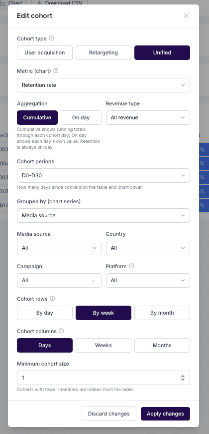
The setup modal controls everything the dashboard computes:
| Setting | Options / limits |
|---|---|
| Conversion window | Any date range up to 366 days |
| Apps | One, several, or all apps in the project |
| View type | User acquisition / Retargeting / Unified |
| Metric + aggregation | See Metrics; Cumulative or On day |
| Revenue type | All / in-app purchases / ad revenue |
| Media source, Geo, Platform | Single-select filters |
| Campaigns | Searchable multi-select, up to 100 campaigns |
| Cohort rows | Day / Week / Month conversion buckets |
| Cohort columns | Day (sparse) / Week / Month periods |
| Max cohort days | How far user age is followed (up to 180 days) |
| Min cohort size | Hide rows smaller than a threshold |
| Group by (chart) | Media source, campaign, country, platform, attribution type, conversion type, app |
Organic traffic
Organic is a media source like any other: organically acquired users are included in your cohorts by default (in the UA and Unified views), with full retention, revenue and session data. You can slice it either way:
- Filter media source = organic to study organic cohorts alone. Cost KPIs disappear — organic has no spend — leaving a clean view of organic user quality, which makes a useful benchmark for paid channels.
- Filter any single paid media source to evaluate that channel: users, revenue and cost all narrow to it together, so eCPI / ROAS / ROI become true paid-versus-paid numbers.
- No media source filter shows the account-level picture: all users (organic included) against total paid spend — see the note on blended cost KPIs above.
On the chart, Group by → media source (or attribution type) plots organic and each paid source as separate lines, so you can compare their retention shapes directly.
My reports
Save a filter configuration under a name and re-apply it with one click. One report can be marked as the default — it loads automatically when you open the dashboard. Reports are stored in your browser, so they don't follow you across devices.

FAQ
Why does my UA view show more revenue than Unified? During a re-engagement window events are credited to both the retargeting campaign and the original UA source. Unified deduplicates; UA includes the double credit by design.
Is organic traffic included in the numbers? Yes — organic is a media source and organic users are part of every cohort by default. Filter media source = organic to see organic cohorts alone, or pick a paid source to evaluate that channel; see Organic traffic.
What is the "unknown" attribution type? Conversions that can't be honestly classified as organic or non-organic — mostly reinstalls: duplicate install events, late-arriving installs, or users re-installing while their previous paid attribution is still valid.
Why is retention "always on-day"? Retention answers "was the user active exactly N days after converting?". A cumulative retention would just be ~100% everywhere and carry no signal.
Why do weekly columns show slightly different user counts than summing the days? Weekly/monthly periods count unique users across the period (a user active on 3 days of the week counts once). Uniqueness across large sets uses approximate distinct counting with a typical error under 2%.
When is the data updated? Cohort data refreshes daily. The current day is always in flight — that's part of what the partial-data marking covers.
Why don't I see cost for my retargeting cohorts? See Cost KPIs — retargeting spend can't be split reliably from the available cost sources, so we hide the columns instead of showing wrong numbers.
My dashboards — what each one is for
A quick map of AdShift's Analyze dashboards — what each one is for, who it's for, and when to use it. Start at Overview, then dive into the detail.
Overview – Main Dashboard
Your daily marketing pulse: see spend, installs, revenue and ROAS across every channel and app in one place — with comparison charts, a drill-down table, and shortcuts into the detail.